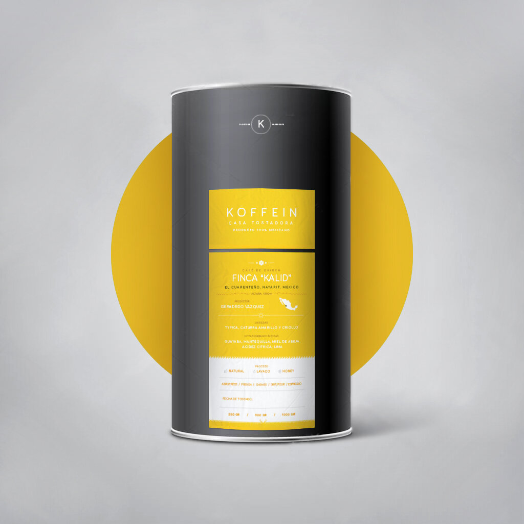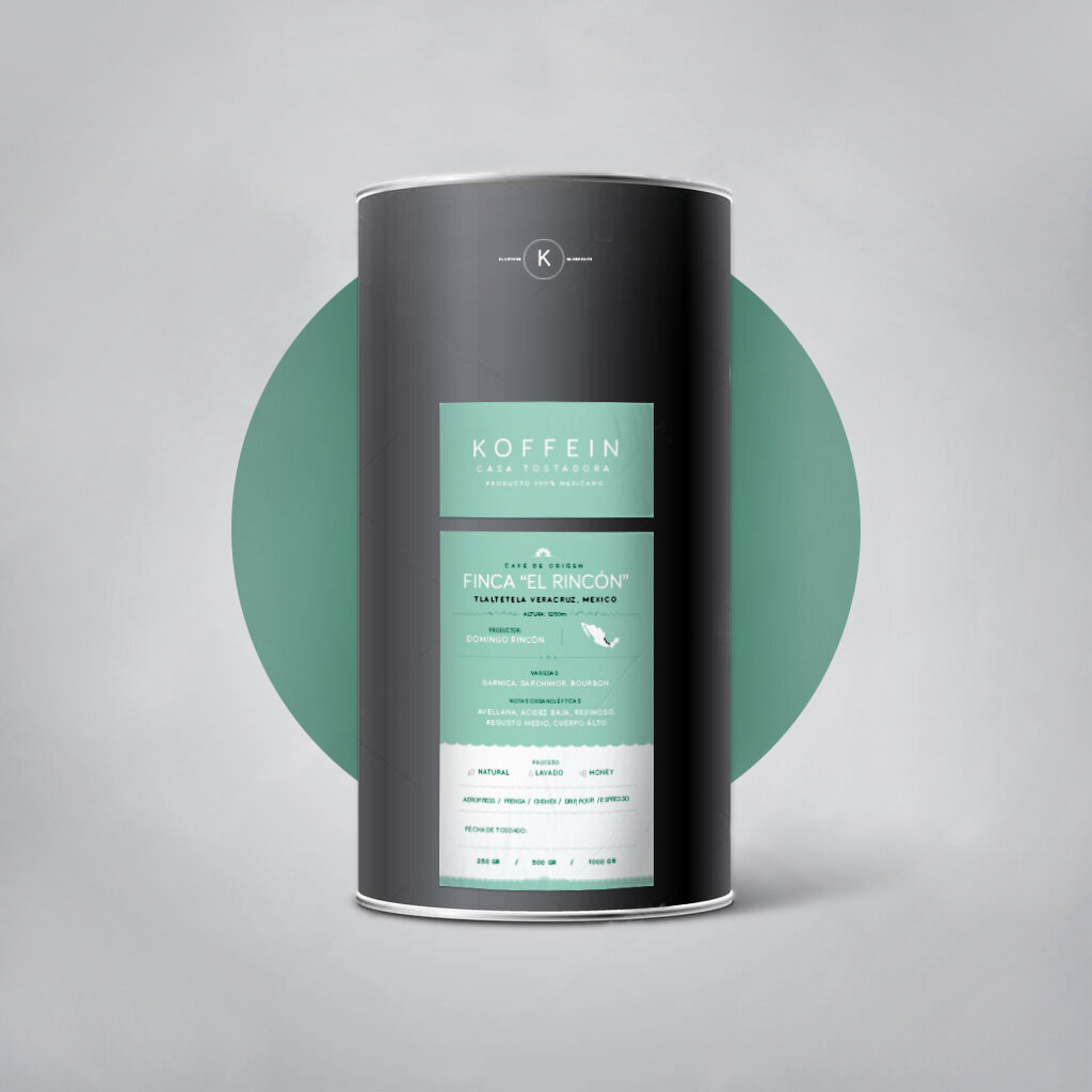
A new look for the good things that come in small packaging.
As the café moved into a new space with new equipment and new e-commerce ventures (selling their beans online), the time had come for making a more conscious effort at brand recognition and appeal. As a DTC business, Koffein needed a brand that translated as well online as it did in the style and character of the retail space.
And as a business that supports sustainable farming, we needed to think about how that sustainability could translate into packaging and materials as well.
Services
Brand Identity/Communication
Logo, Packaging Design, Identity

Bringing Regional Cultivators to life
In thinking through a look and possible color schemes, we wanted a palette that speaks to the intensity of colors and variety of Mexico, while still fitting to the tonality of the retail space. Just like the notes of flavor, the labels offer more of a story and context upon closer inspection. We integrated small details of traditional heritage, identity and design into the labels to convey in subtle ways the character and uniqueness of each of Mexico’s individual coffee regions.
NEW LOOK
Mexico is a colorful tapestry of distinct regions and identities. In order To convey the uniqueness of a single origin coffee from each distinct region and farmer, we integrated subtle elements of each region’s culture and traditional artisan motifs into the label design.

Refillable containers for repeat customers.
A new more eco-friendly, re-usable + accessible alternative for coffee bags. Recycling in Mexico isn’t always readily accessible.
THe idea was to find a common material that could be transformed into re-usable containers, and still look attractive.
cardboard postal tubes convert into a refillable container that is easier to transport and becomes an addition to the kitchen.
Logo
New logo lock-up as Customized stamp cuts for putting branding anywhere.
saves on printed materials + with less materials and cost.


