
A new productS for natural health and living.
A new small business and herbal tincture brand out of Australia launching in 2024 looking to stand out among the competition as something not just stylish but conscious as well. A brand for promoting not just health but healthy lifestyle, while connected to causes that align with traditional plant medicine knowledge of Australia and the Americas.
Services
Brand Identity/Communication
Logo, Packaging Design, Identity, Strategy


MOdern meets ancestral
One of the impact missions for FOTF is aiming to support smaller NGOs that support indigenous medicinal plant knowledge and preservation. Once hitting the market, the brand plans on arranging several relationships to share portions of proceeds and promote awareness with groups such as IPCI (Indigenous Peyote Conservation Initiative).
In initial planning with FOTF, we helped in aligning this impact vision with the brand persona and identity design to reflect their mission.
For the packaging design and social assets, we integrated motifs of traditional/indigenous symbols from both Australia & Americas to connect the underlying cause to the design.
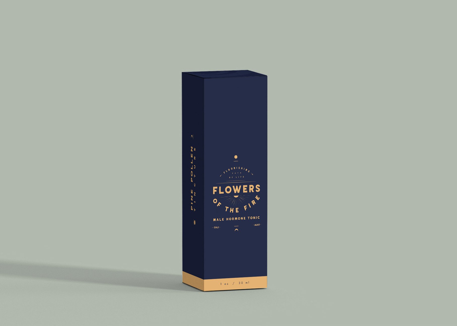
clean & classic
we wanted to stand out in the herbal tincture space a bit with a more clean and classic packaging design to position the products as premium product but with the accessibility of untapped traditional remedies.

A palette with a story
as some of the products are focused on hormone alignment, one of the goals was to communicate through color a sense of the masculine and feminine (hormones) as product personas without being overtly cliché. As we all share the same hormones (just in different concentrations and balances), the idea was to reflect these balances symbolically as inverted colors in the product packaging. Both containing the same colors, just in different balances and concentrations. The motif of day and night of course plays a big part in the design as well, as in indigenous cosmology of sun and moon.
Logo
a number of logo variations were developed based on the custom typeface To build in some flexibility of a variety of products lines and uses.
Noosa, AUSTRALIA
